How to Create Amazon A+ Content Images that Convert Like Crazy
Grabbing customer attention in an oversaturated e-commerce space is no easy feat. But well-optimized A+ Content photos give you a distinct competitive edge. High-quality product photos and artfully crafted Amazon A+ content have immense influence over purchasing decisions. In fact, 75% of shoppers rely on product photography when buying online.
The bottom line is images that engage users lead to more sales. And because Amazon A+ Content is such a critical visual component of your listing, excellent modules and design will boost performance.
In this post, we will explore how to create Amazon A+ Content photos that captivate customers and drive results. You’ll learn technical best practices for resolution, size, and formatting along with design tips for highlighting unique features, conveying information clearly, and maintaining cohesive branding.
Follow these visual merchandising guidelines to create eye-catching images designed to help your product detail page stand out. With compelling Amazon A+ Content, you can showcase your products in the best possible light and turn more store visits into purchases.
Key Technical Specs to Keep in Mind

Photo Quality
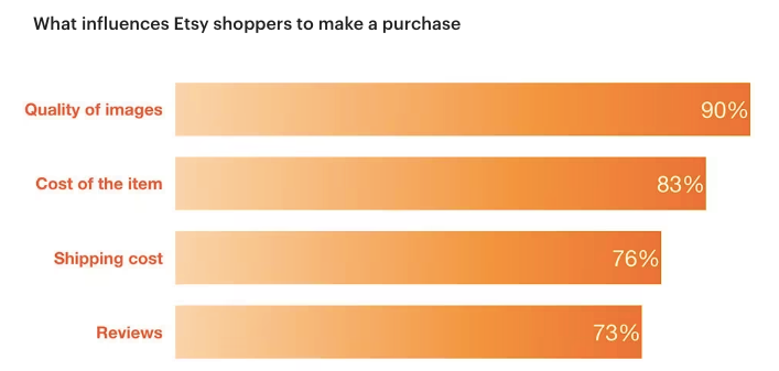
Quality product photos are essential for conveying details and enticing customers. Etsy's buyer surveys indicate that 90% of shoppers said the quality of the photos were “extremely important” or “very important” to a purchase decision.
Good photos should have sharp focus, attractive colors, and enough detail so customers can see exactly what they're buying. Ensure there is high enough brightness and contrast for the product to stand out from the background you're using.
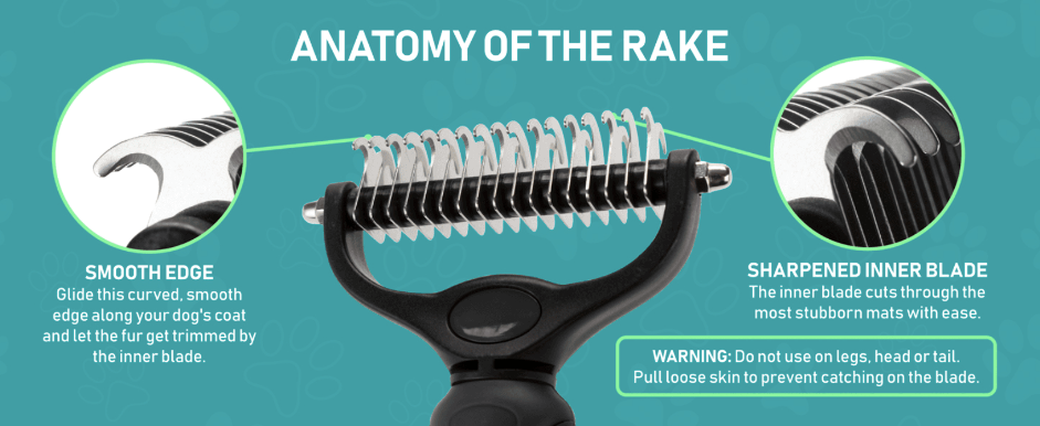
In the example below, the undercoat brush takes center stage and is clearly visible against the solid, contrasting background.
Product photography can be quite technical, so schedule consultations with your photographer to ensure they understand your products and can help showcase them in the best light. Investing in professional high-resolution photographs that accurately and attractively display your products can go a long way in portraying quality and boosting conversions.

Size Requirements
When uploading Amazon A+ Content, pay close attention to the platform's specific image size and resolution requirements. Each module has minimum dimensions that must be met, though images can be larger if the ratio stays the same.
If your images exceed those limits, they will be automatically resized to fit. You can also crop and scale images directly in A+ Content creation tools. In these cases, high-resolution images are helpful because you can crop the photos to fit without losing integrity.
Keep in mind—if you zoom or crop a low-quality file, things can get ugly. No one wants to squint at pixelated photos. For the most up-to-date sizing guidelines per module, consult the Amazon A+ Content image requirements page.

Desktop and Mobile Considerations
Potential customers browse any given product detail page on both the mobile app and their desktops, so it's important to make sure your Amazon A+ Content is optimized for both platforms.
As you create your Amazon A+ content, it's crucial to consider the mobile experience. Mobile screens are much smaller than desktops, so the text needs to be easy to skim and focused only on the most important details. Text-heavy modules can be difficult to read on a tiny mobile screen. Consider what would catch the customer's eye as they quickly scroll through the listing on their phone.

Small details get lost, as we see when comparing the desktop and mobile versions of the dog harness A+ module below. While the image is eye-catching on a desktop, it gets overwhelmed by the large block of text on mobile. Similarly, the bolded title is readable on mobile, but the subtext and paragraph are easy to miss.
To optimize your A+ content modules for mobile shoppers, streamline the text to be scannable, highlight key points, and let your beautiful images do the bulk of the storytelling.

One important side note regardless of the platform—be sure there are no spelling or grammatical errors, which can undermine the quality and professionalism of your listing.
Content Optimization and Design Considerations
Highlight a New USP in Each Module
Images forge an emotional bond with shoppers and shape their purchasing decisions. A survey by BigCommerce found 78% of online shoppers want products brought to life through visuals. To highlight your unique selling points in your product listing images, focus on key differentiators that set your offering apart from competitors in every module.
For example, call out a distinctive feature, benefit, or innovation that separates your product from the pack. You can also include icons to mention awards received. Images that creatively showcase your unique value proposition make the difference when customers are evaluating their many options.
This comforter module dedicates the entire space to a close-up, eye-catching photo of the cute pom fringe detail. The benefit of the decorative fringe is immediately conveyed through the visual alone. The supporting text reinforces and further enhances the understanding of potential customers.
Keeping the photo ultra-prominent with concise text optimized for overlay allows the Unique Selling Point to take center stage. Dedicating a full module to a hero feature is an impactful way to highlight key differentiators within your product listing.

Consider the Bigger Picture and Avoid Repetition
When designing your Amazon A+ Content, avoid reusing the exact same images from your product gallery. The purpose of A+ Content is to showcase unique visual aspects of your product not already highlighted elsewhere. Repetitive images fail to add incremental value for customers.
Instead, think of A+ Content as an extension of your product storytelling. What visually compelling information about fit, usage, comparisons, or details can you convey that isn't already covered? In the example below, notice how the bold colors and inset images work together to provide information about both the product and brand.

Any repetitive images will likely be rejected by Amazon anyway during content review. And even if approved initially, duplicate images may be removed in future policy updates. Create custom images to provide shoppers with truly new perspectives.
Add Text to Your Images
Ready to really show how your product solves customers' problems? Integrate text directly within your images. Combining photos and words communicates more effectively than using either alone. The text in your images provides essential context for your customer and allows you to draw a potential buyer's attention to the feature and benefit you want them to notice.
Overlay your images with short captions, bullet points, or highlights to easily share key details. Don't use big blocks of text separated from images or other wordy text module options—that's too much information, and customers will tune out, especially on their phones. Consider these two modules from different coffee brands. Imagine you're scrolling on your phone. Which one gets its message across first?

Which font size and style is easier to read?
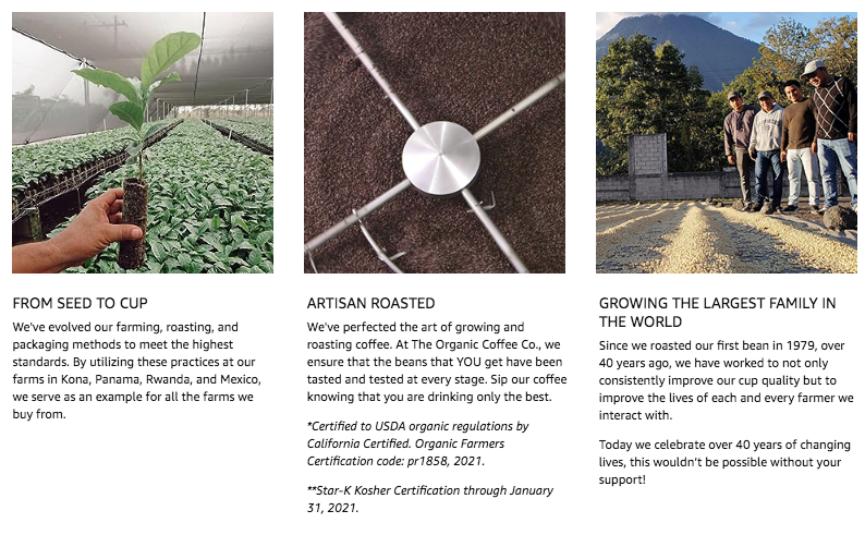
The first module is more likely to grab your attention and keep it. Rather than cram lots of text into the subfields of each module, work with your creative team to make the images flow with just a little supportive text superimposed on the photo here and there. This combo keeps customers engaged while quickly communicating the most important details and showing what makes your product the best choice.
Carefully blending photos and text creates clear content that gives customers a true picture of what to expect. Get this: around 22% of returns happen because the product doesn't match website photos. Crisp, easy-to-see images paired with concise text can reduce confusion and returns by making sure customers know exactly what to expect.
Create Effective Visuals
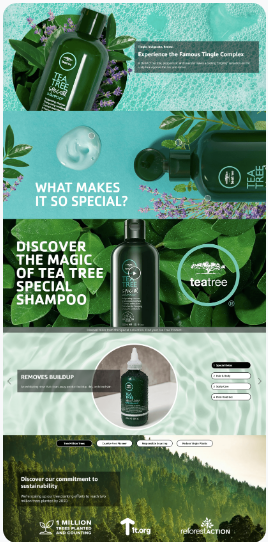
When showcasing your product’s core selling points visually, aim for eye-catching images that relate to each other in a cohesive, harmonious style. Use the same tone, color scheme, and balanced layout across modules.
Below, we've included an example of Amazon A+ Content that is hitting the mark. Notice how the dark green colors and natural motifs are featured in every module alongside simple, bolded headers that draw you in.
Types of Shots
When designing A+ Content, incorporate a variety of photographic angles and contexts to effectively showcase your product. Include close-ups highlighting key details and on-white shots against clean backgrounds to make your product pop.
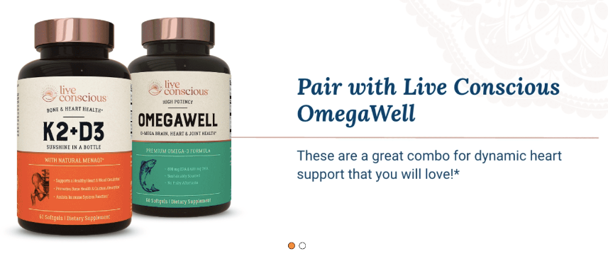
Offering multiple views from different angles can increase sales by 58%, so showcase your product from all sides.
In-context lifestyle images demonstrate scale while allowing customers to envision themselves using the product. Consider the emotional connection forged by this module featuring a stroller.

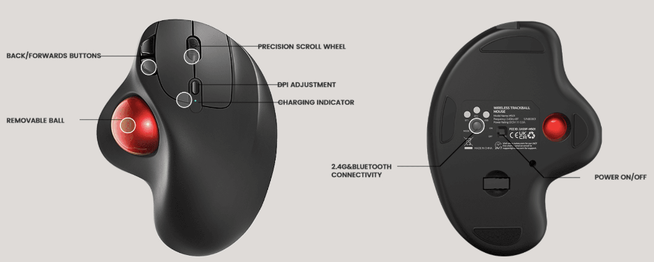
For complex products with a lot of moving parts, create a flat-lay shot showing all the various components. Using a full-image module (as opposed to a standard single left image module, for example, where the image is limited to one side), make sure the photo takes up the entire width of the screen, then superimpose arrows with short blurbs of text pointing out the benefits of the different parts.

To help shoppers browse more easily, add a comparison chart juxtaposing your product against generic competitors or similar products in your line-up, with clear on-white product photos in one row.
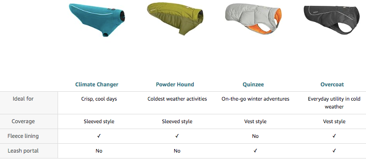
You could also turn to one of the enhanced comparison charts available through the Premium A+ Content program. Premium A+ Content, which we explain in greater detail below, features three different types of comparison charts to choose from, as shown below.
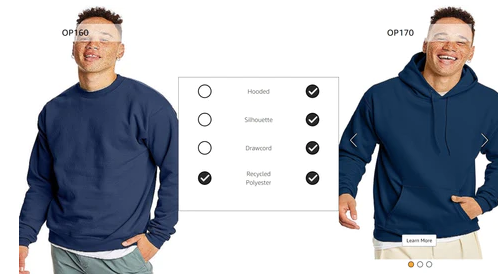
Whatever you choose, whether a full-image module or a comparison chart, the visuals should effectively convey your product’s key features and benefits. Maintaining consistent and complementary images strengthens your brand story and signals quality to customers.
Photoshopped Images
While Photoshopping product images together can seem like an easy, low-cost shortcut, this approach has some downsides for Amazon A+ Content. Heavily edited images that look unrealistic or staged can interrupt the immersive shopping experience quality photos provide.
Customers may have a harder time picturing themselves using products depicted unnaturally. You want shoppers to be drawn into an image because it's appealing and relatable, not because it reminds them of an M.C. Escher drawing (see below).

Consider whether real but well-styled lifestyle images would better showcase your products authentically. Hiring professional models and photographers costs more upfront but prevents distracting quality issues.
If opting for Photoshop, keep edits minimal and seamless. Focus on removing background distractions or inserting your product into context. But avoid overtly artificial manipulations (again, see above—what is she leaning against, anyway?). With strategic touch-ups, Photoshop can enhance photos without looking fake. But in general, authentic images connect best with customers.
AI-Generated Images
AI image generation tools offer an emerging option for creating quality Amazon A+ Content visuals efficiently and affordably. AI software can restore quality, increase resolution, remove backgrounds, and edit product photos with just text prompts. This allows sellers to transform their basic product shots into polished, professional-looking images. AI image generation can save vast amounts of time and money compared to hiring photographers for elaborate shoots.
However, completely AI-generated images may not look fully authentic yet. Subtle—or not-so-subtle—oddities can create an uncanny feel, such as this rendering of a "swan on a lake."

Blending AI enhancements with authentic product photos can balance cost and quality. AI can refine real images or insert products into relevant contexts rather than generating full scenes. In the example below, AI has created different backgrounds for the same product shot.
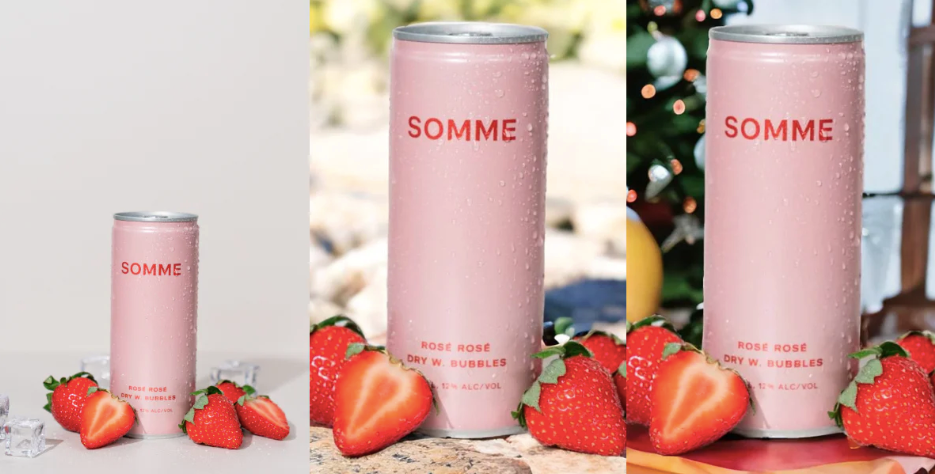
As the technology improves, AI-generated images will become more realistic. For now, use AI as an enhancement tool for polishing and elevating the visual impact of your A+ Content.
Amazon Premium A+ Content Visuals
How to Qualify
Brand-registered sellers can qualify for A+ Premium Content by meeting a few key requirements:
-
An existing brand story, which appears across all of the seller's Amazon listings.
-
If you'd like our help with crafting an optimized brand story, contact us about our Brand Booster package. This custom service includes recommendations for images and a brand story module layout, as well as two bonus image recommendations you can use on your website or product detail page.
-
-
At least 5 Amazon A+ Content project submissions approved within the past 12 months.

Approval Process Pro Tip
To quickly qualify for A+ Premium Content, you can make small edits to your existing approved A+ Content and resubmit it. You don't need 5 totally separate product listings approved. Instead, you just need 5 Amazon A+ content pieces approved in total. Many Amazon experts recommend this easy workaround to rapidly unlock A+ Premium. Simply tweak your current A+ Content, get the revised version approved, and repeat this process until you have 5 approvals. This approach allows you to tap into premium content features faster.
Why Upgrade to Premium A+ Content?
Upgrading to Premium A+ Content unlocks additional modules that allow for more impactful imagery compared to Standard A+ Content. Here are some key benefits of Premium modules in terms of aesthetics and visual storytelling:
-
Say More with Less: Premium A+ Content allows brand-registered sellers to communicate more through visuals than text, which can be particularly helpful given the strict character limits on Amazon and the large share of shoppers browsing on small mobile screens. This visual emphasis can help to increase sales, with Amazon suggesting a potential increase of up to 20%. Notice how this bold and high-impact Premium A+ Full Image module for an air purifier tells a relatable, personal story without a single word.

-
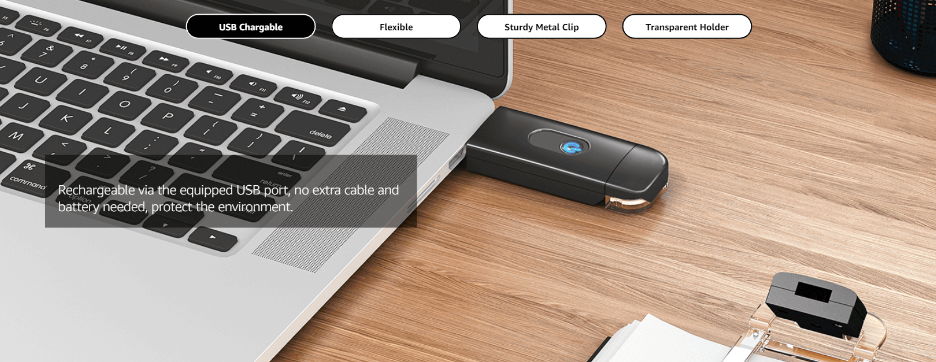
More Interactive Content: Premium A+ Content includes a range of upgraded modules that offer more interactivity compared to basic content. From clickable Hotspot modules and comparison charts with interactive features to full-image galleries set within a single module (see below), these engaging modules offer a more memorable shopping experience.
-
Wide Selection of Modules: There's a significantly larger selection of modules available in Premium A+ Content, with 17 premium and interactive modules on top of the 12 basic modules. For a more in-depth breakdown of all your options, check out our Complete Guide to Premium A+ Content.
These visual elements are designed to create a more appealing and engaging experience for Amazon customers, potentially leading to higher conversion rates and increased brand recognition.
The Power of Amazon Premium A+ Content Videos
If you have access to Premium, consider incorporating short videos to maximize impact. According to HubSpot, consumers pay more attention to video than other content formats like long blocks of text. People often skim articles but will watch an engaging, high-quality video.
Video allows you to vividly demonstrate your product's key features and unique selling points. Viewers get a dynamic, three-dimensional understanding of what you're offering versus static images alone.
Seek to captivate attention in the first few seconds with an eye-catching intro. Use text overlays to highlight standout aspects as the video plays.
Keep it concise at 1-2 minutes max. Well-executed video content in your Amazon A+ Content can convey the essence of your brand while efficiently informing and persuading shoppers.

Conclusion
At the end of the day, compelling product photography is crucial for driving conversions and sales on your marketplace listing. A+ Content allows you to tell a visual story to customers that text alone cannot match. Take the time to capture high-quality images from multiple angles and contexts. Integrate text seamlessly to create cohesive modules that clearly communicate your product’s value.
Looking for hands-on help enhancing your product photography and A+ Content? Our team of experts can analyze your current listing and provide strategic recommendations to maximize your visual impact. Check out our Free Listing Analysis to get started. Or go all-in with an end-to-end listing and A+ Content overhaul through our Baddest Brand on the Block service. Contact us today to learn more!


Leave a comment
Please note, comments must be approved before they are published